sometimesmaybe Posted May 25, 2023 Share #61 Posted May 25, 2023 Advertisement (gone after registration) just finishing the above thought... i shot and edited these 2 images earlier this year. here is Angela in both colour (GFX) and monochrome (m246) sorry i dont know where this stream of consciousness is going... maybe in monochrome i know i cant hide behind colour, so the light and the composition have to be bang on. while in colour i know i can get the viewer to look at the 'pretty girl'. i think colour makes me lazy (that and autofocus) Welcome, dear visitor! As registered member you'd see an image here… Simply register for free here – We are always happy to welcome new members! Quote Link to post Share on other sites Simply register for free here – We are always happy to welcome new members! ' data-webShareUrl='https://www.l-camera-forum.com/topic/344964-the-psychology-of-quitting-colour/?do=findComment&comment=4779151'>More sharing options...
Advertisement Posted May 25, 2023 Posted May 25, 2023 Hi sometimesmaybe, Take a look here The psychology of "quitting" colour. I'm sure you'll find what you were looking for!
ramarren Posted May 25, 2023 Share #62 Posted May 25, 2023 4 hours ago, sometimesmaybe said: coming from this at a different angle thought i'd process a colour image into a monochrome image what i realised is that i shot this image with 1 key subject (Belle) and 2 supporting subjects (optimistic signage + brown brutalist apartments) in mind. in my view, the shades of brown makes the sign a tad ironic... it has a real 'double speak' dread about it the monochrome image is gritty, but it feels just a tad less playful Welcome, dear visitor! As registered member you'd see an image here… Simply register for free here – We are always happy to welcome new members! In the color image, the principal character is nicely highlighted and separates from the background well. The B&W conversion is too bright in the sky, distracting the eye, and the principal character details get lost in a dark murk of poorly separated tones. Rebalanced a little in the B&W, it will have a similar feel and intensity to the color image. G 1 Quote Link to post Share on other sites More sharing options...
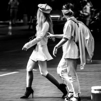
ramarren Posted May 25, 2023 Share #63 Posted May 25, 2023 4 hours ago, sometimesmaybe said: just finishing the above thought... i shot and edited these 2 images earlier this year. here is Angela in both colour (GFX) and monochrome (m246) sorry i dont know where this stream of consciousness is going... maybe in monochrome i know i cant hide behind colour, so the light and the composition have to be bang on. while in colour i know i can get the viewer to look at the 'pretty girl'. i think colour makes me lazy (that and autofocus) Welcome, dear visitor! As registered member you'd see an image here… Simply register for free here – We are always happy to welcome new members! Both of these are quite nice figure studies, with a nice balance of colors and tone in the color image, and nice tones in the B&W. G Quote Link to post Share on other sites More sharing options...
ramarren Posted May 25, 2023 Share #64 Posted May 25, 2023 19 hours ago, LocalHero1953 said: Neither. And as images, although they are technically competent, I find both lacking in interest. Sorry for the negativity, but you asked..... 23 hours ago, Ouroboros said: I don’t think either version ‘says’ anything. I don’t like the weird alternating cyan-magenta-cyan casts in the sky on the colour version that bleeds into the corners and the tree branches and the shadows in the grass due to the vignette, so I guess the mono version gets the nod but it’s lacking in contrast and rather too much dark foreground for my taste. I’d concentrate on a black and white image to enhance the various textures and the building, which, as the point of focus, is rendered far better in black and white, if I was considering the scene. 16 hours ago, Budfox said: For this scene, the monochrome gives a more isolationist feel that seems to work better. Thank you all. Different folks' perceptions and perspectives are always valuable. G 1 Quote Link to post Share on other sites More sharing options...
sometimesmaybe Posted May 25, 2023 Share #65 Posted May 25, 2023 7 hours ago, ramarren said: In the color image, the principal character is nicely highlighted and separates from the background well. The B&W conversion is too bright in the sky, distracting the eye, and the principal character details get lost in a dark murk of poorly separated tones. Rebalanced a little in the B&W, it will have a similar feel and intensity to the color image. G i guess thats the around about point that im trying to make when i scouted that location i saw the image i wanted to make and the brownness of the building played a large part, hence i only shot that location with a coloured camera (i didnt bother with the m246) if i only had my m246, the image i would have emphasised the grittiness of the location - more 'doom'. thats why when i was converting this image (just for this LUF thread) to monochrome, i dropped the exposure and added more shadow (the darkness is the new supporting subject in lieu of brown) just to tie this all up for me (after having gone through this exercise), it crystallises my suspicion that i'd shoot and edit differently depending on whether i use a monochrome camera or not 2 Quote Link to post Share on other sites More sharing options...
ramarren Posted May 26, 2023 Share #66 Posted May 26, 2023 17 hours ago, sometimesmaybe said: i guess thats the around about point that im trying to make when i scouted that location i saw the image i wanted to make and the brownness of the building played a large part, hence i only shot that location with a coloured camera (i didnt bother with the m246) if i only had my m246, the image i would have emphasised the grittiness of the location - more 'doom'. thats why when i was converting this image (just for this LUF thread) to monochrome, i dropped the exposure and added more shadow (the darkness is the new supporting subject in lieu of brown) just to tie this all up for me (after having gone through this exercise), it crystallises my suspicion that i'd shoot and edit differently depending on whether i use a monochrome camera or not That's certainly true for me ... I look for things differently depending on whether I'm carrying the color camera or the B&W camera. I also expose differently. BUT ... that doesn't mean I don't look at and think of what the colors in a scene are going to do with a B&W capture. I consider that and choose which filter I'm going to use in response, from none to whichever of the appropriate filters I have might be. I know I can get some amazing photos with no filter at all, but finding just the right filter, matched to the colors and how I want them to be translated, allows another level of magic to happen. G 1 Quote Link to post Share on other sites More sharing options...
IkarusJohn Posted May 26, 2023 Share #67 Posted May 26, 2023 Advertisement (gone after registration) On 5/25/2023 at 10:32 PM, sometimesmaybe said: coming from this at a different angle thought i'd process a colour image into a monochrome image what i realised is that i shot this image with 1 key subject (Belle) and 2 supporting subjects (optimistic signage + brown brutalist apartments) in mind. in my view, the shades of brown makes the sign a tad ironic... it has a real 'double speak' dread about it the monochrome image is gritty, but it feels just a tad less playful Welcome, dear visitor! As registered member you'd see an image here… Simply register for free here – We are always happy to welcome new members! I think these images illustrate nicely that a good black and white image is not just a colour conversion, and that colour images are most striking (to my mind) when the colour is controled. 2 Quote Link to post Share on other sites More sharing options...
pippy Posted May 29, 2023 Share #68 Posted May 29, 2023 On 5/24/2023 at 4:26 PM, ramarren said: Okay ... Just a litmus test. Which of the two following photographs "says more" to you?... I prefer the colour image. Philip. Quote Link to post Share on other sites More sharing options...
pippy Posted May 29, 2023 Share #69 Posted May 29, 2023 On 5/25/2023 at 11:32 AM, sometimesmaybe said: ...thought i'd process a colour image into a monochrome image... For me it's the muted colours which make the image work. P. Quote Link to post Share on other sites More sharing options...
Olaf_ZG Posted May 30, 2023 Share #70 Posted May 30, 2023 10 hours ago, pippy said: For me it's the muted colours which make the image work. P. Indeed, the less screaming the colors, the better it gets… Quote Link to post Share on other sites More sharing options...
Olaf_ZG Posted June 18, 2023 Share #71 Posted June 18, 2023 This weekend I had two diners, one with whom I took the monochrom, the other the SL. With both i got great (family) photos. The monochrom focused on expressions, layers and gestures. With the SL, the focus goes to the eyes ( close up portraits as i want to get rid of the background). Both families will be happy with the results, as both sets are great. Funny though, with the monochrom i used a 50mm, and those shots are wider then the shots with sl plus 35, good to have both. Quote Link to post Share on other sites More sharing options...


Recommended Posts
Join the conversation
You can post now and register later. If you have an account, sign in now to post with your account.
Note: Your post will require moderator approval before it will be visible.