MikeMyers Posted September 4, 2021 Author Share #61 Posted September 4, 2021 Advertisement (gone after registration) 9 hours ago, frame-it said: yes its better to install it and get the free upgrade, they can be very fussy about licensing at a later date..and after installing it whether you use it or not is upto you but at least it's available I started clicking on links last night to learn about the upgrade, which led me to pasting in lots of information including a photo of the sales receipt from B&H Photo, which led to downloading the newest version and setting it up. By then it was going on 1am, and I headed for bed. I did start the SilverFast, and it recognized my scanner, so all was well. The last thing I saw was a screen full of instructional videos, which I didn't watch (yet). I intend to stick with VueScan until when/if I have a good reason to try SilverFast. As far as I know, nobody has yet given me a good reason why I should switch, and several posts suggested VueScan was easier to work with. Quote Link to post Share on other sites More sharing options...
Advertisement Posted September 4, 2021 Posted September 4, 2021 Hi MikeMyers, Take a look here Scanning - Leica + B&W Film + Plustek OptiFilm + VueScan. I'm sure you'll find what you were looking for!
MikeMyers Posted September 4, 2021 Author Share #62 Posted September 4, 2021 7 hours ago, 250swb said: For Casey I think you need to accentuate the highlights a lot more. Enough? Welcome, dear visitor! As registered member you'd see an image here… Simply register for free here – We are always happy to welcome new members! Quote Link to post Share on other sites Simply register for free here – We are always happy to welcome new members! ' data-webShareUrl='https://www.l-camera-forum.com/topic/324032-scanning-leica-bw-film-plustek-optifilm-vuescan/?do=findComment&comment=4269241'>More sharing options...
MikeMyers Posted September 4, 2021 Author Share #63 Posted September 4, 2021 (edited) 7 hours ago, 250swb said: As far as manipulation goes just treat the image as it if it was a traditional darkroom print, where you'd have a choice of chemicals and six grades of paper available to manipulate the contrast, plus all the dodging and burning that a great photograph would have applied to it (haven't you already posted a photo of James Dean with the printers notes, does the end result look manipulated?). For Casey I think you need to accentuate the highlights a lot more. Here is another example of how news and fine art photos are manipulated in the darkroom, no negative is perfect and the art is to see what type of treatment tells the story of the photograph in the best way.....the dodging and burning notes for Don McCullin's 'Shell Shocked Marine' Welcome, dear visitor! As registered member you'd see an image here… Simply register for free here – We are always happy to welcome new members! Their skill is light-years beyond what I know how to do, but from now on, I'll try harder to get a more perfect image. Those notes are obvious, now, as I read them and look at the photo, but most of them refer to something I never would have noticed, but for the notes. Maybe a year from now, I'll be better at this. One thing is for sure, the feedback from you guys is invaluable, as you notice things that I missed. I posted one of these images in the DxO PhotoLab4 forum, and got so many replies on things I could have done better. If you want to read them, it's towards the end of this discussion: https://feedback.dxo.com/t/how-i-feel-after-about-a-year-of-using-pl4-as-my-go-to-image-editor/20701/16 Among other things, I learned not to use telegraph poles for a help in making my photos "level", as these poles are often tilted. I didn't do my dust correction very well, as I didn't know I could select the point that PL4 uses to over-write the dust. I used to scan at 7200dpi, which made my files too large. I switched to 3600dpi, and maybe in the future, I should try 2400dpi. Edited September 4, 2021 by MikeMyers Quote Link to post Share on other sites More sharing options...
MikeMyers Posted September 4, 2021 Author Share #64 Posted September 4, 2021 I learned how to make my "old" photos look their age. I just adjust the color setting in PL4: I also found tools for keeping all the vertical lines vertical, and for doing a better job of dust elimination. Welcome, dear visitor! As registered member you'd see an image here… Simply register for free here – We are always happy to welcome new members! Quote Link to post Share on other sites Simply register for free here – We are always happy to welcome new members! ' data-webShareUrl='https://www.l-camera-forum.com/topic/324032-scanning-leica-bw-film-plustek-optifilm-vuescan/?do=findComment&comment=4269416'>More sharing options...
250swb Posted September 4, 2021 Share #65 Posted September 4, 2021 (edited) 7 hours ago, MikeMyers said: Enough? Welcome, dear visitor! As registered member you'd see an image here… Simply register for free here – We are always happy to welcome new members! I'll be impertinent (sorry if it treads on toes) and show you what I mean. Increasing the contrast visually accentuates the arrow motif on the train and the cigarette and gaze that faces the other way, so it becomes a balanced image with the human element truly focused against his railway engine, there is a tension in what he could be thinking or waiting for. The other changes I made were to burn in the edges of the frame so the increase in contrast doesn't just end up with pure white in the sky, and also dodge the hands so they become more powerful, and I added a slightly warmer tone for the image, it doesn't add a lot but it's another added benefit from processing as an RGB file. What I did is maybe more than you like, but it's no good going halfway to show an example. This is no more than using chemicals and paper grades in the darkroom. Edited September 4, 2021 by 250swb 2 Quote Link to post Share on other sites More sharing options...
MikeMyers Posted September 4, 2021 Author Share #66 Posted September 4, 2021 (edited) 17 minutes ago, 250swb said: I'll be impertinent (sorry if it treads on toes) and show you what I mean. Increasing the contrast visually accentuates the arrow motif on the train and the cigarette and gaze that faces the other way, so it becomes a balanced image with the human element truly focused against his railway engine, there is a tension in what he could be thinking or waiting for. The other changes I made were to burn in the edges of the frame so the increase in contrast doesn't just end up with pure white in the sky, and also dodge the hands so they become more powerful, and I added a slightly warmer tone for the image, it doesn't add a lot but it's another added benefit from processing as an RGB file. What I did is maybe more than you like, but it's no good going halfway to show an example. I have high strength steel covers for all my toes, so feel free to stomp on them all you want. 🙂 It's an interesting effect - if I were making a billboard, this is so strong nobody could miss it. What I don't like, is that it doesn't look like a real photograph that I might have taken. There won't be anything like this in any of the dozens of railroad related photo books that I have. To me, there is a line between "enhancing" an image (including correcting mistakes such as scratches or dust on the negative), and "photo art". When I look over photos posted on this forum, most of which are from a Leica camera, I enjoy seeing what the photographer captured with the camera, and that doesn't include bizarre "artsy" effects. My hat says "photojournalist" on it, not "photo artist". I just posted a phone toned for "sepia". I don't think photographers way back when went to any efforts to achieve that effect - I think it just naturally happened with age. To me, the sepia makes the photos look like the were taken half a century ago. If I was making a 16x20 print to hang on a wall, your version is more appropriate than my "more boring" version. Again, I'll have to think about this for a while. I guess I should try to replicate what you did, so I'll know how, in the future. Your version is more appropriate to display on a billboard. My version is what I envisioned when I took the photo. Both have a purpose. Edited September 4, 2021 by MikeMyers 1 Quote Link to post Share on other sites More sharing options...
250swb Posted September 4, 2021 Share #67 Posted September 4, 2021 Advertisement (gone after registration) 3 minutes ago, MikeMyers said: I have high strength steel covers for all my toes, so feel free to stomp on them all you want. 🙂 It's an interesting effect - if I were making a billboard, this is so strong nobody could miss it. What I don't like, is that it doesn't look like a real photograph that I might have taken. There won't be anything like this in any of the dozens of railroad related photo books that I have. To me, there is a line between "enhancing" an image (including correcting mistakes such as scratches or dust on the negative), and "photo art". When I look over photos posted on this forum, most of which are from a Leica camera, I enjoy seeing what the photographer captured with the camera, and that doesn't include bizarre "artsy" effects. My hat says "photojournalist" on it, not "photo artist". I just posted a phone toned for "sepia". I don't think photographers way back when went to any efforts to achieve that effect - I think it just naturally happened with age. To me, the sepia makes the photos look like the were taken half a century ago. If I was making a 16x20 print to hang on a wall, your version is more appropriate than my "more boring" version. Again, I'll have to think about this for a while. I guess I should try to replicate what you did, so I'll know how, in the future. Your version is more appropriate to display on a billboard. My version what I envisioned when I took the photo. Both have a purpose. I can see what you mean Mike, I may have use a 'William Klein' type of contrast in my example. All I'll say to follow up is to have a look at the photographs of perhaps the ultimate railway photographer Winston Link and see how he deals with contrast and how it brings out the eye candy in the scene overall and in the trains. http://www.artnet.com/artists/o-winston-link/ Quote Link to post Share on other sites More sharing options...
MikeMyers Posted September 4, 2021 Author Share #68 Posted September 4, 2021 He had a wonderful eye, and designed his own equipment to capture those images of steam locomotives at night. Beautiful photos. I hope he earned the kind of money while he was alive, that his photos are selling for now. I have friends who do train photography of this caliber, but they are mostly train photographers who learned how to get the best images, day or night. I never did have an opportunity to photograph working steam locomotives. I guess I was born too late, but if I was born earlier, I probably wouldn't be here now. Back to this discussion, I guess we all have our own "style", and as for me, it's constantly evolving as I learn the tools, and try to get them to do what I envision in my mind - but my mind is like modeling clay, and the feedback I get is constantly causing me to re-evaluate things. I couldn't do yesterday what I can do today, and I couldn't do a few days ago what I could do yesterday. When I get my M3 back, I'll hopefully be able to do new photography as well as what I used to, and if I don't get the M3 back, I will be a Leica film camera, quite likely the M-A. Quote Link to post Share on other sites More sharing options...
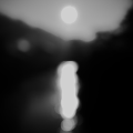
MikeMyers Posted September 5, 2021 Author Share #69 Posted September 5, 2021 Latest scan, inside the train control room, 1960's, adjusted for more contrast, an almost sepia tone, darkening what's outside the window, and dust removal. Welcome, dear visitor! As registered member you'd see an image here… Simply register for free here – We are always happy to welcome new members! 1 Quote Link to post Share on other sites Simply register for free here – We are always happy to welcome new members! ' data-webShareUrl='https://www.l-camera-forum.com/topic/324032-scanning-leica-bw-film-plustek-optifilm-vuescan/?do=findComment&comment=4269507'>More sharing options...
MikeMyers Posted September 5, 2021 Author Share #70 Posted September 5, 2021 It seems like I spend more time cleaning dust and debris off my negatives than anything else in scanning and processing. I ordered one of these a few days ago, and it just arrived. https://www.bhphotovideo.com/c/product/24592-REG/Ilford_1203547_Antistaticum_Anti_Static_Cloth.html I got to try it for the first time half an hour ago. While there was still some dust or whatever on the negative, it was maybe 1/10th as much as what I've been dealing with until now. Hopefully this is typical for me from now on. As I was going through my negatives, I found some I had forgotten about. Long ago, a youngster with a camera could ask the train engineer if he could come up for a "cab ride" and there was an excellent chance he'd be invited into the cab of the engine. The windshield wasn't all that clean usually, but here's a shot that I got through a perfectly clean windshield. I can't remember how I got home though..... Years later, when I took the train on trips to Seattle and Florida, I'd show my photo album of my model railroad to the porters in the train cars, and more often than not, they'd arrange for me to go up to the engine, camera in hand. That would never happen nowadays!!!! The scanning is going better than I ever expected. I highly doubt I could make prints this good in my old darkroom. I'm sure someone with Ansel's ability could do many, many times better, but all I could do back then was burn, or dodge, or tilt the easel. The computer and software provides SO much more control. Welcome, dear visitor! As registered member you'd see an image here… Simply register for free here – We are always happy to welcome new members! Quote Link to post Share on other sites Simply register for free here – We are always happy to welcome new members! ' data-webShareUrl='https://www.l-camera-forum.com/topic/324032-scanning-leica-bw-film-plustek-optifilm-vuescan/?do=findComment&comment=4269515'>More sharing options...
david strachan Posted September 5, 2021 Share #71 Posted September 5, 2021 Love your train pics Mike. They work well presented "old world" low contrast. The antistatic cloth could be the answer...wish i had one a long time ago...i just became an expert at spotting prints. ... Quote Link to post Share on other sites More sharing options...
MikeMyers Posted September 5, 2021 Author Share #72 Posted September 5, 2021 14 minutes ago, david strachan said: Love your train pics Mike. They work well presented "old world" low contrast. The antistatic cloth could be the answer...wish i had one a long time ago...i just became an expert at spotting prints. ... Thank you! I'm having a great time creating them, and every day I find ways (often here) to do it better. I didn't know if the cloth would work or not, but bought it anyway. It (or my use of it) isn't perfect yet, but it is FAR better than before I started to use it. I still need to read the directions - maybe I'm not even using it properly. Spotting my images in PhotoLab4 is easy, but when there are hundreds of them, it's rather tedious. I just hunt them down, one after another, and zap them with the tool. I found out today it's more complicated than that - sometimes I need to tell the tool WHERE to copy pixels from. I'm gradually adding these train related photos to a folder on my SmugMug gallery, m.smugmug.com - by clicking on them, anyone can view them full size. 1 Quote Link to post Share on other sites More sharing options...


Recommended Posts
Join the conversation
You can post now and register later. If you have an account, sign in now to post with your account.
Note: Your post will require moderator approval before it will be visible.