evikne Posted September 3, 2018 Share #1 Posted September 3, 2018 (edited) Advertisement (gone after registration) I just wondered: Is the red color in this forum meant to symbolize the color in the Leica logo? The forum color is very nice, but the real Leica red is much more "old fashioned" and pale (100% magenta and yellow in CMYK). Welcome, dear visitor! As registered member you'd see an image here… Simply register for free here – We are always happy to welcome new members! Edited September 3, 2018 by evikne Quote Link to post Share on other sites Simply register for free here – We are always happy to welcome new members! ' data-webShareUrl='https://www.l-camera-forum.com/topic/288197-the-red-forum-color/?do=findComment&comment=3585093'>More sharing options...
Advertisement Posted September 3, 2018 Posted September 3, 2018 Hi evikne, Take a look here The red forum color. I'm sure you'll find what you were looking for!
earleygallery Posted September 3, 2018 Share #2 Posted September 3, 2018 You need to ask Andreas, but I expect the forum is a modified template which probably has limited options to customise it. In any case, it's not a Leica owned site so they might object if it was designed to look like it was an official Leica site. Quote Link to post Share on other sites More sharing options...
jaapv Posted September 3, 2018 Share #3 Posted September 3, 2018 I just wondered: Is the red color in this forum meant to symbolize the color in the Leica logo? The forum color is very nice, but the real Leica red is much more "old fashioned" and pale (100% magenta and yellow in CMYK). Leica-logo.jpg Interesting PDF - the crossed-out options can be found all over the place, including Leica products - for instance the square lettering in conjunction with the dot on the SL. Quote Link to post Share on other sites More sharing options...
andybarton Posted September 3, 2018 Share #4 Posted September 3, 2018 It's a seven year old pdf. Quote Link to post Share on other sites More sharing options...
evikne Posted September 3, 2018 Author Share #5 Posted September 3, 2018 It's a seven year old pdf. But the Leica logo has been unchanged for more than 100 years. Welcome, dear visitor! As registered member you'd see an image here… Simply register for free here – We are always happy to welcome new members! Quote Link to post Share on other sites Simply register for free here – We are always happy to welcome new members! ' data-webShareUrl='https://www.l-camera-forum.com/topic/288197-the-red-forum-color/?do=findComment&comment=3585144'>More sharing options...
earleygallery Posted September 3, 2018 Share #6 Posted September 3, 2018 There's been many variations over the years, Leitz and Leica, dots, no dots, and the colour of my R3 box is a very different red to the red they use today! Quote Link to post Share on other sites More sharing options...
farnz Posted September 3, 2018 Share #7 Posted September 3, 2018 Advertisement (gone after registration) ... and then there's orangey-red dot on the M240. Pete. Quote Link to post Share on other sites More sharing options...
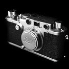
adan Posted October 9, 2018 Share #8 Posted October 9, 2018 (edited) Wordmarks are - funny. The red circle/white calligraphic script logo is owned by Leica Microsystems, and licensed to Leica Camera and Leica Geosystems (all former parts of Ernst Leitz GMBH and then Wild Leitz - final "divorce" in the 1990s). I have no idea why Microsystems got control of the logo - perhaps because they got to keep the original Wetzlar factory and signage? When introduced on the R3 in 1976, it of course said "Leitz," not "Leica." The Leicaflex and M5 introduced the blocky LEICA or LEICAFLEX name-plates, white on black or black on white, in addition to the traditional thin-line script. The red dot appeared briefly on some M4-2s (1977), and full-time with the M4-P (1980). On those Canadian cameras, the calligraphic script logo was also stamped into the top plate, and filled with white paint. M6s can be found with both Leitz and Leica red dots. They even made it onto a handful of larger -R lenses - I guess just to fill blank space, or as "advertising" at sports events (280 f/2.8, 180 f/2.0 and similar hefty teles/zooms). Now, that script is based on the original camera engraving. Which, engraving technology being what it was up through 1980 or so, did not have the calligraphic changes in the thickness of the logo version. It had a constant line weight scribed into the metal. Welcome, dear visitor! As registered member you'd see an image here… Simply register for free here – We are always happy to welcome new members! Apparently, that older thin script engraved on all cameras from the 1920s until the 1970s is not subject to the same licensing rules as the red curvy logo, since Leica Camera has used that freely on MPs, M-Ps, M9-Ps, M-10Ps and special editions. In white or black, not red, and without needing a red background. And while the calligraphic, "swooshy" script is fairly recent on cameras and a few lenses, it is not new in Leica marketing (although in black). Anyway, as a point of personal privilege, I prefer the older, "non-typographic" engraving - the simple thin line of the engraving tool. For almost every camera brand. And not for nostalgia reasons, but because it just looks more industrial, like a tool (the only serious way to think of a camera). Nikon's progression (on cameras, not boxes and ads) was Nikon - until 1971 (intro of F2) Nikon - until 1988 (intro of F4) Nikon - ever since Google up a Canon P or F-1, or a Pentax Spotmatic, or a Nikon FTn image - that's how I like camera names to look. (Adn for the ultimate "camera logo from Hell," look up the Canon T90 - seriously, it lists the camera's features on the front?) BTW - what does that "style guide" say about taping over red-dot logos? Edited October 9, 2018 by adan Quote Link to post Share on other sites Simply register for free here – We are always happy to welcome new members! Apparently, that older thin script engraved on all cameras from the 1920s until the 1970s is not subject to the same licensing rules as the red curvy logo, since Leica Camera has used that freely on MPs, M-Ps, M9-Ps, M-10Ps and special editions. In white or black, not red, and without needing a red background. And while the calligraphic, "swooshy" script is fairly recent on cameras and a few lenses, it is not new in Leica marketing (although in black). Anyway, as a point of personal privilege, I prefer the older, "non-typographic" engraving - the simple thin line of the engraving tool. For almost every camera brand. And not for nostalgia reasons, but because it just looks more industrial, like a tool (the only serious way to think of a camera). Nikon's progression (on cameras, not boxes and ads) was Nikon - until 1971 (intro of F2) Nikon - until 1988 (intro of F4) Nikon - ever since Google up a Canon P or F-1, or a Pentax Spotmatic, or a Nikon FTn image - that's how I like camera names to look. (Adn for the ultimate "camera logo from Hell," look up the Canon T90 - seriously, it lists the camera's features on the front?) BTW - what does that "style guide" say about taping over red-dot logos? ' data-webShareUrl='https://www.l-camera-forum.com/topic/288197-the-red-forum-color/?do=findComment&comment=3609186'>More sharing options...


Recommended Posts
Join the conversation
You can post now and register later. If you have an account, sign in now to post with your account.
Note: Your post will require moderator approval before it will be visible.