evikne Posted August 8, 2017 Share #21 Posted August 8, 2017 (edited) Advertisement (gone after registration) Have been following this thread. In addition to the color calibration I am curious on wheter M10 owners use the default import settings for contrast, black, white, clarity and vibration, or if you have twaked the import settings for these values. Anyone who have their own improt settings they want to share? I simply add 10 % contrast to my images. I think this is the best starting point when I wish the most natural look. I use the Leica M10 profile in LR, and on my calibrated screen I think no other adjustments are necessary if the images are taken in good light conditions (I use ambient light only). I usually use WhiBal or ExpoDisc for the most realistic colors, although I think M10's AWB is the best I've tried so far. Edited August 8, 2017 by evikne 2 Quote Link to post Share on other sites More sharing options...
Advertisement Posted August 8, 2017 Posted August 8, 2017 Hi evikne, Take a look here M10 colors oversaturated? -Merged thread-. I'm sure you'll find what you were looking for!
tomlens Posted August 8, 2017 Share #22 Posted August 8, 2017 As Olaf said: The colors of the M10 with the Adobe Standard profile are good, far better than the colors of the M9/M240. But they could be better, especially the skin tones, and they are a bit oversaturated. Desaturation is like a shot gun. It works for much purposes, but it seems not the best way to me. Here are my adjustments in the camera profile menu for the Adobe Standard profile. Bildschirmfoto 2017-08-07 um 17.09.16.jpg Olaf has similar adjustments. In addition to them I sometimes desaturate green. Elmar Thanks. This was helpful. 1 Quote Link to post Share on other sites More sharing options...
Don Morley Posted August 8, 2017 Share #23 Posted August 8, 2017 (edited) No, you're not. The digital Leica M colours all are badly over-saturated indeed. The M9 was worst, the M (Typ 240) slightly better, and now the M10 slightly better again but still far from natural. Besides the exaggerated saturation, there's also the reds too purplish and the blues also too purplish. And yes, the Camera Raw/Lightroom profile "LEICA M10" is much worse than "Adobe Standard". Amazing how we all differ! I love the M9 colours as they are so near those of my beloved Kodachrome hence I have never been happy with those from my M240's and so although I have no experience of the M10 the only reason I would buy one is BECAUSE others including Leica themselves say the M10's colour output is nearer to that of the M9. Cant please em all I suppose! Don Morley Edited August 8, 2017 by Don Morley 1 Quote Link to post Share on other sites More sharing options...
01af Posted August 8, 2017 Share #24 Posted August 8, 2017 I love the M9 colours as they are so near those of my beloved Kodachrome ... What!? M9 colours close to Kodachrome colours? You're kidding, right? They're worlds apart. Olaf has similar adjustments. Umm, yes ... but my first attempt was a bit over the top. Your reduced adjustments are better. In addition to the color calibration I am curious on wheter M10 owners use the default import settings for contrast, black, white, clarity and vibration ... In the meantime, I have created a dual-illuminant colour profile using the Gretag-Macbeth (now X-Rite) ColorChecker and the Adobe DNG Profile Editor. Using that profile (instead of "LEICA M10" or "Adobe Standard"), I furthermore adjusted some of Camera Raw's/Lightroom's sliders' default values. These include: Basics pane: Contrast -5; Vibrance -5; Saturation -5. Details pane: Sharpening Amount 15; Sharpening Radius 0.8; Sharpening Detail 40; Noise Reduction Color 0. If in higher-ISO images I introduce some colour noise reduction then it usually is between 5 and 20, rarely at Adobe's default of 25 which for low-ISO images is waay too much. And then I set Color Detail and Color Smoothing as required which almost always is significantly lower than Adobe's defaults of 50. 3 Quote Link to post Share on other sites More sharing options...
@ndy_ellis Posted August 8, 2017 Share #25 Posted August 8, 2017 This is v interesting - glad the topic expanded. How about dehaze in LR10? I find that useful but I don't have on preset. Quote Link to post Share on other sites More sharing options...
pedaes Posted August 8, 2017 Share #26 Posted August 8, 2017 What!? M9 colours close to Kodachrome colours? You're kidding, right? They're worlds apart. In your opinion. I think Don Morley's experience and career as a professional photographer makes his view equally valid. Quote Link to post Share on other sites More sharing options...
Jeff S Posted August 8, 2017 Share #27 Posted August 8, 2017 Advertisement (gone after registration) I have Passport profiles, but don't bother with changing LR import defaults since each pic varies. But after many years printing... both darkroom and digital, my PP workflow is efficient nonetheless. Jeff 1 Quote Link to post Share on other sites More sharing options...
Al_OOF Posted August 8, 2017 Share #28 Posted August 8, 2017 In the case, rather than increase the contrast I see a better result by lowering the value of blacks and increasing that of the whites Quote Link to post Share on other sites More sharing options...
01af Posted August 8, 2017 Share #29 Posted August 8, 2017 What!? M9 colours close to Kodachrome colours? You're kidding, right? They're worlds apart. In your opinion. I think Don Morley's experience and career as a professional photographer makes his view equally valid. Uh-huh. Fine. Have a look with your own eyes. Here's a shot I took four years ago with my Leica M9. One version is the DNG straight out of Camera Raw, with camera profile 'Embedded' and most sliders at default, except white balance up (towards yellow, because the camera's preset was 'Sunny' and the actual wheather was cloudy) and exposure +0.65 (because the shot is slightly underexposed). The other is tweaked using the gradation curve as well as pushing many sliders from the Basic and HSL panes, to create what I feel is coming fairly close to a Kodachrome 25 look. Which is which? You (or Don Morley) tell me ... Welcome, dear visitor! As registered member you'd see an image here… Simply register for free here – We are always happy to welcome new members! Quote Link to post Share on other sites Simply register for free here – We are always happy to welcome new members! ' data-webShareUrl='https://www.l-camera-forum.com/topic/275413-m10-colors-oversaturated-merged-thread/?do=findComment&comment=3332763'>More sharing options...
pico Posted August 8, 2017 Share #30 Posted August 8, 2017 Besides the exaggerated saturation, there's also the reds too purplish and the blues also too purplish. And yes, the Camera Raw/Lightroom profile "LEICA M10" is much worse than "Adobe Standard". Sorry for my confusion but are talking print or monitor? Do you mean 'magenta' rather than 'purplish' (rather violet)? Quote Link to post Share on other sites More sharing options...
fatihayoglu Posted August 8, 2017 Share #31 Posted August 8, 2017 Uh-huh. Fine. Have a look with your own eyes. Here's a shot I took four years ago with my Leica M9. One version is the DNG straight out of Camera Raw, with camera profile 'Embedded' and most sliders at default, except white balance up (towards yellow, because the camera's preset was 'Sunny' and the actual wheather was cloudy) and exposure +0.65 (because the shot is slightly underexposed). The other is tweaked using the gradation curve as well as pushing many sliders from the Basic and HSL panes, to create what I feel is coming fairly close to a Kodachrome 25 look. Which is which? You (or Don Morley) tell me ... ou-1130323-0841_A.jpg ou-1130323-0841_B.jpg I am not a master of these things but I think 1st one looks too yellow and if the day is cold and cloudy, I guess the 2nd picture looks more real, where people have red noses and red cheeks due to the cold weather. Quote Link to post Share on other sites More sharing options...
jaapv Posted August 8, 2017 Share #32 Posted August 8, 2017 Thanks for these, Olaf. I just got a new Macbook Pro and I see that I really need to calibrate it ASAP. Quote Link to post Share on other sites More sharing options...
adan Posted August 8, 2017 Share #33 Posted August 8, 2017 1. Getting too worked up over what "looks like Kodachrome" and what doesn't is pointless. Kodachrome was always a schizophrenic film, depending on exposure. A "bright" exposure gave pastel colors, while a dark exposure gave strong saturated colors. Here are four 1960s-era pictures showing Kodachrome II in its different "moods." http://www.thephoblographer.com/wp-content/uploads/2014/03/kodachrome-flickr-plcjr.jpg http://www.swanngalleries.com/news/wp-content/uploads/2013/08/ErnstHass-1.jpg http://theonlinephotographer.typepad.com/.a/6a00df351e888f88340134860c7cd8970c-800wi https://s-media-cache-ak0.pinimg.com/236x/d5/ae/6d/d5ae6dbeed22f58c022d8111cab2c005.jpg When there were 2-3 ISOs contemporaneously (KII/X or K25/64/200), each speed looked quite a lot different from the others - for color, K25 looked more like Fuji 50D, not K64. I know - I did the comparison in 1986. Plus, in this day and age, what is the "Kodachrome" one sees? Projected originals? Low-res internet? Printed with ink in books? Old books with traditional optical separations, or modern books with digital scans? Prints: vintage dye transfer, or C-prints via internegative, or digital from scans? I was in the underexpose-a-bit, saturated, Ernst Hass/National Geographic/Jay Maisel school of Kodachrome, so that is what I seek (and easily find - with correct handling) in either M9 or M10 pictures. 2. In 01af's samples above (thanks for contributing actual pictures!): Yes, the M9 (default, bottom) had a screwy default profile with magenta reds. Properly profiled with a ColorChecker, it didn't. I don't especially like either of those versions (the "corrected" skins tones go too yellow and sallow in most of the faces even thought the "man-made" clothing reds are better). I don't think either look especially "Kodachromy" - more like Provia or color neg images. The M10's default embedded profile is a lot better than the M9's - it requires less adjustment to settings/calibration to get to the same "look." 3. Pop quiz: Kodachrome 25, or M9? Welcome, dear visitor! As registered member you'd see an image here… Simply register for free here – We are always happy to welcome new members! 4. Back to the M10....... 10 Quote Link to post Share on other sites Simply register for free here – We are always happy to welcome new members! 4. Back to the M10....... ' data-webShareUrl='https://www.l-camera-forum.com/topic/275413-m10-colors-oversaturated-merged-thread/?do=findComment&comment=3332870'>More sharing options...
01af Posted August 8, 2017 Share #34 Posted August 8, 2017 Here are four 1960s-era pictures showing Kodachrome II in its different "moods." The first one comes closest to my idea of Kodachrome. I was in the underexpose-a-bit, saturated, Ernst Hass/National Geographic/Jay Maisel school of Kodachrome I see. I prefer properly exposed or slightly over-exposed Kodachrome. Yes, the M9 (default, bottom) ... Exactly. I don't especially like either of those versions (the "corrected" skins tones go too yellow and shallow in most of the faces Yes, I didn't really nail it ... it was a quick-and-dirty attempt at a non-calibrated monitor. Still, much closer to Kodachrome than the other version I think. The M10's default embedded profile is a lot better than the M9's ... Better, yes—but not 'a lot.' Both go into the same (wrong) direction, and the M10 is only so much better than the M9 ... Pop quiz: Kodachrome 25, or M9? From first sight I'd say, under-exposed Kodachrome ... but the file name suggests a carefully and savvily processed M9 image. Quote Link to post Share on other sites More sharing options...
adan Posted August 9, 2017 Share #35 Posted August 9, 2017 (edited) So, in the spirit of inquiry (and to get back to the M10) - two versions of the same M10 shot, one processed (to the best of my ability) for the 01af approach to Kodachrome (or more accurately, the look of that World's Fair shot in my previous post), the "crisp, dry Chenin blanc" look. And one processed more to my taste, the "rich Vintage Port" flavor (like KII/K25 underexposed a tad for intensity - with maybe a drop of Velvia as the "aguardente vinica"). BTW - correct, that previous pond shot is M9. Both use the default "M10 Embedded" profile - the differences are all in the "development" pane (white balance, exposure, blacks, whites, shadows, contrast, highlights, global saturation - none of which were "default"). "My" version uses saturation +10, the "dry" version uses saturation -15 and adds a touch of Clarity. My version uses WB of 5200K, -5 green tint; the other uses 4900 K and zero tint - neither uses the Adobe "Auto" or "As shot" or eye-dropper WB (gaaack!). Point being - the M10 can produce either of these looks, but defaults to neither. Which is good in my book. I'd hate it if the default looked like the less-saturated version, and I don't mind a few mouse clicks or saved presets to get to the version that I (and my editors, employers, print buyers, and contest judges also appear to) prefer. Everyone else can pay their money and take their choice, or find anything in between. Welcome, dear visitor! As registered member you'd see an image here… Simply register for free here – We are always happy to welcome new members! Edited August 9, 2017 by adan 6 Quote Link to post Share on other sites Simply register for free here – We are always happy to welcome new members! ' data-webShareUrl='https://www.l-camera-forum.com/topic/275413-m10-colors-oversaturated-merged-thread/?do=findComment&comment=3333169'>More sharing options...
mdemeyer Posted August 9, 2017 Author Share #36 Posted August 9, 2017 Agree... one can create (virtually) whatever look s/he wants in this technology age. Personal preference is the final arbiter and whether we have the same or different preferences doesn't matter. One system (camera + processing) can satisfy us both. 2 Quote Link to post Share on other sites More sharing options...
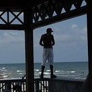
jonoslack Posted August 9, 2017 Share #37 Posted August 9, 2017 So many different approaches. Here's mine My problem is that it seems to me that each image often deserves a different approach, so that making up presets can make some images worse and some better. In daylight I always shoot 'sunny', because it's like shooting a particular film stock - you know what you're getting - the difference is that it's easy to change later if you need. The AWB on the camera isn't bad . . . but I want to decide! I use the' Adobe Standard' profile because it's gentler than the embedded M10 profile - I think it was rather clever of them to organise it so that Leica produced something 'hot' and Adobe something 'cool'. Leica put a lot of effort into the colour for the M10 with a huge database of DNG files and lots of input from lots of people - I think they did a pretty good job! All the best 11 Quote Link to post Share on other sites More sharing options...
elmars Posted August 9, 2017 Share #38 Posted August 9, 2017 Yes, Jono, Leica did a great job with the colors of the M10 (way beyond the M240). A s far as I know they investigated the color taste of the people with the help of a university of technology. The modification in the camera profile I suggested above are subtle and a matter of taste. So it is with color saturation. I nearly always shoot "cloudy", when I am outside, not AWB. So I can remember the color situation better and I have the control, that all photos of one situation look alike. Elmar 2 Quote Link to post Share on other sites More sharing options...
Chuck Albertson Posted August 9, 2017 Share #39 Posted August 9, 2017 We've had sunny weather in Seattle for the past 50+ days, but for the last two weeks have been inundated with smoke from the 100+ bushfires burning to the north in British Columbia. So I finally pulled out my Passport chip chart over the weekend and shot a frame of it so that I could create a Lightroom profile with it. It was quite different from the Adobe Standard profile, and also the others I have created for sunny weather. Quote Link to post Share on other sites More sharing options...
mdemeyer Posted August 10, 2017 Author Share #40 Posted August 10, 2017 Elmar, Tried your tweaked Adobe profile last night on some images and it seems we see very much alike. Thanks for sharing. Michael Yes, Jono, Leica did a great job with the colors of the M10 (way beyond the M240). A s far as I know they investigated the color taste of the people with the help of a university of technology. The modification in the camera profile I suggested above are subtle and a matter of taste. So it is with color saturation. I nearly always shoot "cloudy", when I am outside, not AWB. So I can remember the color situation better and I have the control, that all photos of one situation look alike. Elmar 1 Quote Link to post Share on other sites More sharing options...


Recommended Posts
Join the conversation
You can post now and register later. If you have an account, sign in now to post with your account.
Note: Your post will require moderator approval before it will be visible.